ROLE: DESIGN CONSULTANT
UX TASKS: USER TESTING, WIREFRAMES, TASK FLOWS, UI Design
BACKSTORY
Haydle is a solution for the issues of knowledge retention and capturing tribal knowledge within an organization. Currently, subject matter experts are constantly bombarded with repetitive questions from a variety of coworkers. Haydle provides a place for everyone within an organization to ask and answer questions related to the business; it is the single best place to ask and answer any question. Adoption of Haydle will provide tangible benefits to productivity, information retention, communication, and employee lifecycles. The platform connects people to find answers.
After reading Laura Klein's UX for Lean Startups, Haydle was interested in having the UX team at Tradecraft facilitate usability testing for its product. Initially, I explored the product independently for two weeks, and then I was the project lead for a team to further develop design suggestions in a second phase of the project.
PURPOSE
After discussions with Haydle's CEO, we identified onboarding as an aspect of the product that could most benefit from a usability test. From this point, I went through the existing protocols for a new Haydle customer and I was made the administrator of Tradecraft's account. I experienced the current process with explanations from a Haydle representative and had answers to basic questions waiting for me when I first logged into the product.
The landing page when users first enter Haydle.
From this point onward, the usability study for Haydle was directed towards finding barriers to entry and points of frictions for new users. Later, these observations would be used to make informed design recommendations.
PROCESS
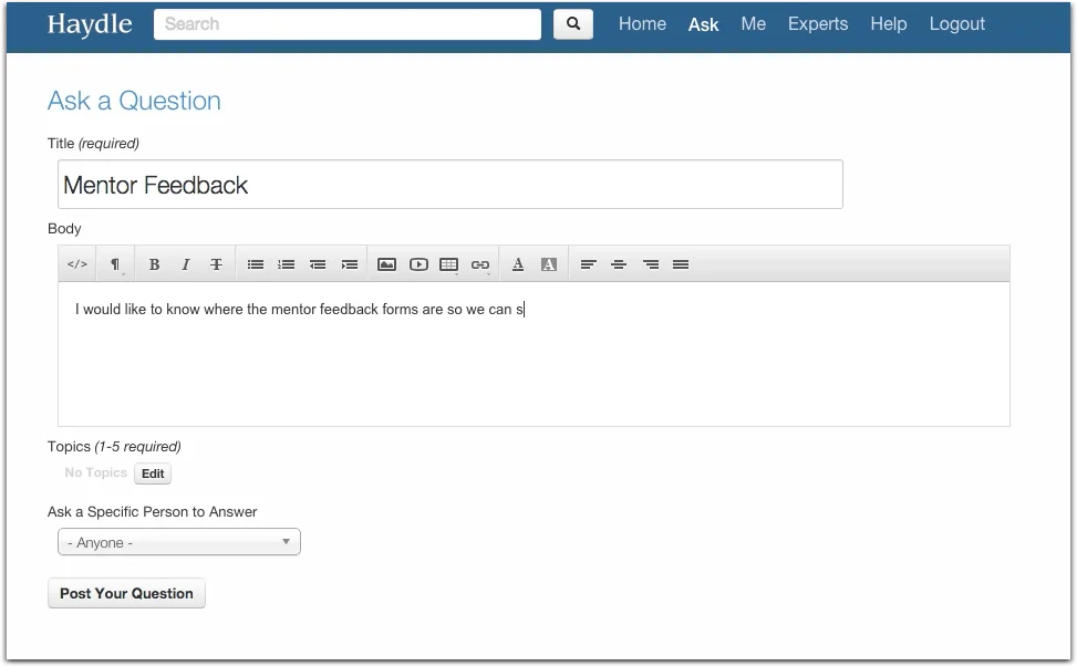
Due to the fact that Haydle is an internal tool for companies to capture and disseminate information, I invited members of the Tradecraft team to sign up for our own internal account. These colleagues were not involved in the project and were not members of the design team. I asked them to sign-up at a scheduled time where I could record and observe their initial experiences with Haydle. The task presented was to post two questions on the forum for the participants colleagues to see.
Screen capture from usability study video.
Upon completion of the usability studies, videos and notes were reviewed to confirm the findings that were uncovered. Issues that clearly posed barriers to entry for new users varied in their prevalence, but all major opportunities for improvement from the study were addressed.
OPPORTUNITIES
Issue 1 - Search Bar
Some users went to the search bar on the home page to ask a question.
"They should change that for sure."
"Have the search bar ask the questions."
"I don't know what else to do."
Solution:
Bring the search bar down out of the header in order to limit its prevalence and pull the "Ask" feature out of the general navigation so that there is a greater call to action.
Issue 2 - Bar Icon
Users were unclear on what the bar icon signified upon first impression.
"Doesn't correlate to job title or ability to answer question? That's interesting."
"It looks like bars mean answers."
Solution:
If the data behind the rating system is not expressed or known, it is better to eliminate the feature rather than include an element without proper context.
Issue 3 - "Needs Chosen Answer"
These concepts need improved labeling.
"I don't even know what "Needs Chosen Answer' is!"
"I don't even know that there is a difference between 'Needs Chosen Answer' and "Unanswered.'"
Solution:
Going forward, this should be labeled as 'Needs Best Answer.' If this category continues to cause confusion after multiple iterations, it is likely that it needs to be removed and implemented differently.
Issue 4 - Title vs Body
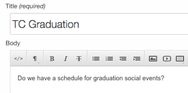
There is ambiguity as to where the question should be entered. This is a labeling issue that needs to be addressed.
Solution:
When the fields are labeled with 'Title' and 'Body,' it puts the user in the wrong frame of mind. These headings put one in the mindset of writing an e-mail, when the task at hand is posting a question. Greater clarity can be achieved by labeling the fields with 'Question' and 'Additional Information.'
Issue 5 - Topic Entry
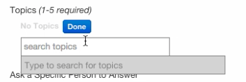
No users in the study found this part of the question posting process intuitive. The first instinct was to separate topics with commas or push enter to select. Participants did not like entering topics one at a time.
"Instead of typing topics, I wish there was a drop-down."
"It would be better for organizations if topics were already created."
"Not having commas to delineate each topic is not the most intuitive."
Solution:
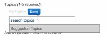
It is critical to indicate that 'Suggested Topics' will be provided. By implementing this system, attention will be drawn to the negative impact of simply using commas to create new topics which could be similar to pre-existing topics that have already been created.
Issue 6 - Unclear Questions Completion
This is the screen that appears when a question is first submitted to Haydle. There is nothing to inform the user that the task has been completed. No summary is provided and it is a dead-end that forces the user to go to the task bar in order to exit.
"Cool. I'm guessing my question was posted, which is slightly frustrating."
"There's no way to go back other than the browser controls or keyboard shortcuts."
Solution:
Without overhauling the entire visual experience, establish subtle visual cues to inform the user when tasks have been completed.
Issue 7 - Error Message
Users were continually attempting to submit questions without completing the topic tags. It appears that they opt to skip this small part of the process thinking it isn't essential. After attempting to submit, they are confronted with a jarring, red alert that they have not completed the process.
"Dude, that's not cool."
Solution:
Simply replace the large red box with subtle highlights that users will find less alarming.
Issue 8 - "Experts"
When first using Haydle, the 'Experts' area is not easy to understand, but this is due to a lack of questions and users. During onboarding, users were interested in this feature, but it has little to know impact on the immediately experience.
"Ok, Quora definitely needs that."
Solution:
A simple pop-up for users the first time they visit the page that explains its purpose. After a certain number of experts have been featured on the page, the feature will automatically turn off.
Issue 9 - E-mail Triggers
There needs to be some sort of explanation as to how this feature notifies the person.
Solution:
This is a simple iconography issue. Rather than overcomplicate things with extensive UI changes, just include a familiar visual prompt that lets users know that those selected will be notified via e-mail.
Issue 10 - Tab Navigation
When users wanted to 'tab' from 'Topic' to 'Body,' they were forced to cycle completely through all the commands for the dialogue box.
"Frustrating the first go-around."
"Any time you tab through and it takes you to buttons but not text prompts is frustrating."
Solution:
This is an engineering solution that is a quick-fix to give users what they want.


